Maximum Use Concentration Explained for Meme Coins
Learn what maximum use concentration means for Solana meme coins, how to read it, and why it matters for token safety before you buy.
Published
Updated
You're staring at a token report, the chart is moving, and one line on the screen looks more technical than helpful. Maximum use concentration can feel like that kind of label, a single number with no obvious meaning until you know what it's measuring and what it's comparing against. In a meme-coin workflow, that number is only useful when you read it the way a risk analyst reads a balance sheet, as one piece of context, not a verdict by itself.
A lot of buyers stop at the first unfamiliar metric and either ignore it or overreact to it. That's the trap this guide clears up. Think of the number as a concentration cap tied to a category and a wallet population, not a magic safety stamp, and it becomes much easier to tell whether a token looks spread out, tightly controlled, or somewhere in between.
Table of Contents
- The Moment You See the Number on Screen
- What Maximum Use Concentration Actually Means
- Why the Same Percentage Tells Different Stories
- How the Number Gets Calculated On-Chain
- Reading the Number Against Practical Thresholds
- Three Solana Meme Coin Scenarios
- Why No Percentage Is Universally Safe
- A Practical Checklist Before You Buy
The Moment You See the Number on Screen
You paste a Solana contract into a checker, wait for the report, and the first thing that catches your eye isn't price action or volume. It's a line with a concentration figure, and the problem is simple, you don't know whether that number is a yellow flag, a green light, or just noise. Most first-time buyers have been there, especially when the rest of the report is full of holder data, liquidity notes, and wallet patterns that move faster than the eye can sort them.
The confusion is normal because the label sounds formal, but the decision you need is practical. You're trying to answer a plain question, “Does too much control sit in too few wallets?” That's the same basic decision behind many on-chain safety checks, including holder concentration signals that tools like MemeAssist surface in their risk reports and danger scoring.
A single metric only helps when you know what it caps, what it excludes, and what context makes it meaningful.
That's why this number shouldn't be read like a score out of 100. It's closer to a ceiling. If the wallets behind a token are too concentrated, the token can behave like a thin market with one hand on the wheel. If the wallets are more dispersed, the same report line tells a calmer story. The rest of this guide turns that one line into something you can read quickly, the way you already read market cap or liquidity depth.
What Maximum Use Concentration Actually Means
Maximum use concentration is the highest concentration level that still fits a defined risk context. In occupational hygiene, the term has a precise meaning. Ontario defines it as the highest airborne concentration at which a specific respirator is expected to protect a worker, calculated by multiplying the respirator's assigned protection factor by the applicable occupational exposure limit. That same logic is useful in crypto, even though the subject is different, because the number only makes sense when you know the category it belongs to and the population it applies to. Ontario's regulation formalizes that calculation and also reminds readers that the result still has to sit within the relevant exposure limit framework.
A token risk version of the same idea
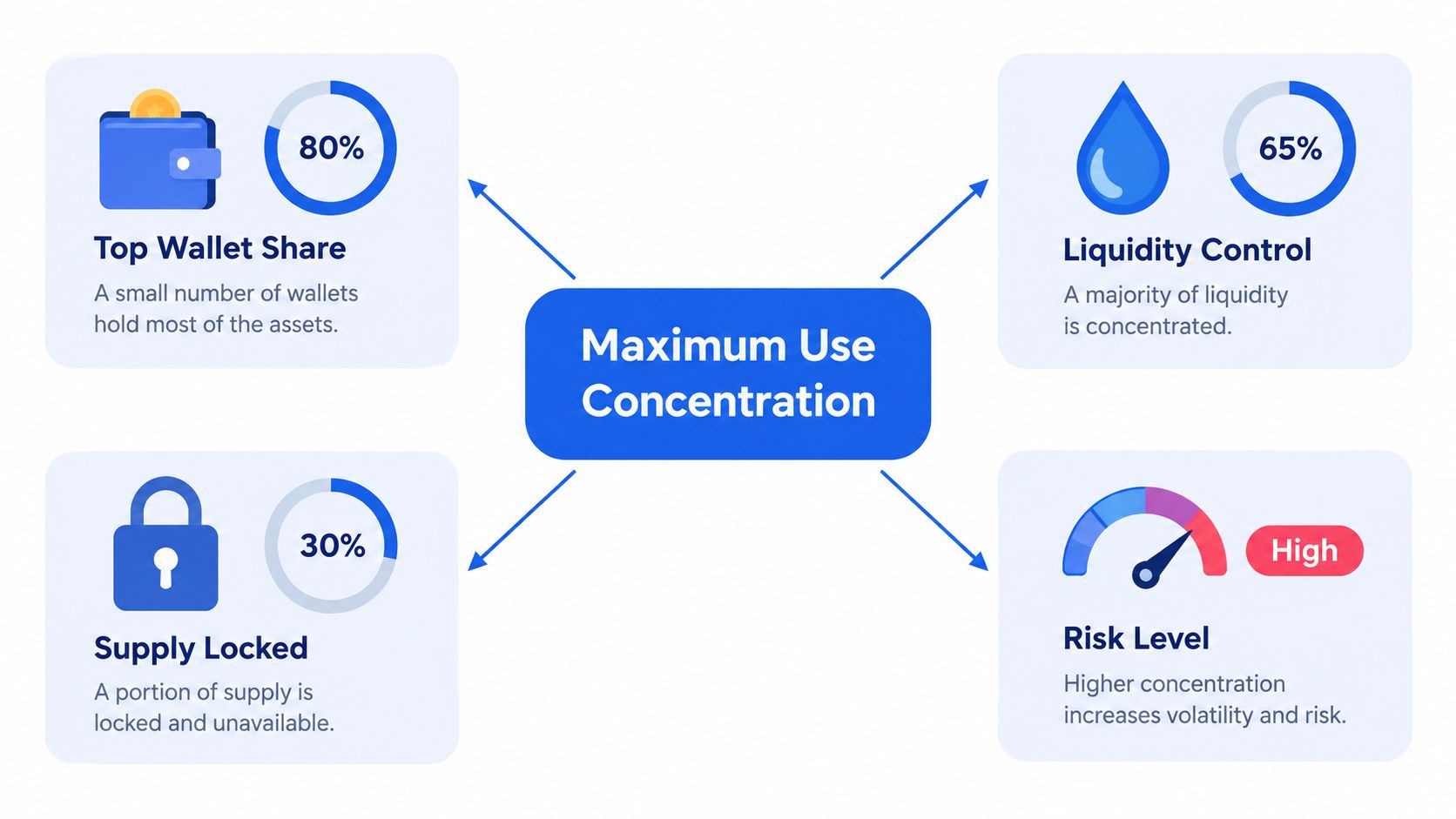
In a meme-coin report, maximum use concentration can be read as the highest share of supply or liquidity that's still acceptable inside a given token context. The important part is the context. A percentage by itself doesn't tell you whether the top wallets are organic community holders, creator-linked wallets, bundled allocations, or a tight cluster with control over liquidity.
That's why the number belongs next to other metrics, not instead of them. Holder count tells you how many wallets are involved. Top-wallet share tells you how much of the supply sits in the largest accounts. Liquidity concentration tells you who can influence trading depth. Maximum use concentration is the umbrella reading, the cap that helps you decide whether the distribution still fits the kind of token you're looking at.
Why the respirator analogy works
The hygiene definition shows the structure clearly. A respirator is not “safe” in the abstract, it's expected to protect only up to a certain concentration, and even then only under the right conditions. Ontario's framework also notes that the calculation has to stay within the relevant TWA, STEL, or ceiling limit, and that IDLH conditions, cartridge limits, fit, and workplace conditions still matter. The crypto parallel is obvious. A token distribution can look acceptable on paper and still be fragile if liquidity is thin, the holder cluster is suspicious, or the wallet behavior points to control elsewhere.
The same logic helps you avoid a common mistake, treating one number as a permanent product label. In practice, the useful read is always: what category am I in, who holds the supply, and what kind of control sits behind the metric?
Why the Same Percentage Tells Different Stories
A percentage is useful, but it's never the whole story. In token analysis, the same concentration level can mean two opposite things depending on the token category, the use pattern, and the wallet population behind it. That's not a theory problem. It's the difference between a token that's early and a token that's effectively controlled.
Category changes the meaning
A freshly launched meme coin doesn't behave like a mature community token. Early supply concentration can be normal at launch, just as a leave-on exposure scenario in cosmetics gets treated differently from a rinse-off one. The point isn't that concentration is good or bad by default. The point is that the surrounding structure changes how much risk the same percentage carries.
Use pattern changes the risk
The behavior of the wallets matters as much as the number itself. Long-term holders who entered gradually create a different profile from wallets that funded in a cluster, bought in sync, and moved together. If the flow looks coordinated, a moderate concentration can be more concerning than a larger but more distributed one. That's why a report can look “fine” at first glance and still deserve caution once you inspect the wallet pattern.
Population changes the interpretation
A concentrated slice spread across many independent wallets is not the same as the same slice sitting inside a tight insider cluster. The token may look balanced on a summary line while hiding a group that acts like one decision-maker. That's why holder clusters matter. If you want a deeper look at how those clusters are read, wallet clusters on Solana are worth understanding before you size a trade.
Practical rule: never read concentration without checking whether the wallets behave like a crowd or like one coordinated actor.
The reason this matters is simple. A number can only describe distribution. It can't tell you whether that distribution is healthy unless you know who is inside it and how they're acting. That's the part many traders miss when they fixate on one percentage and skip the wallet story underneath it.
How the Number Gets Calculated On-Chain
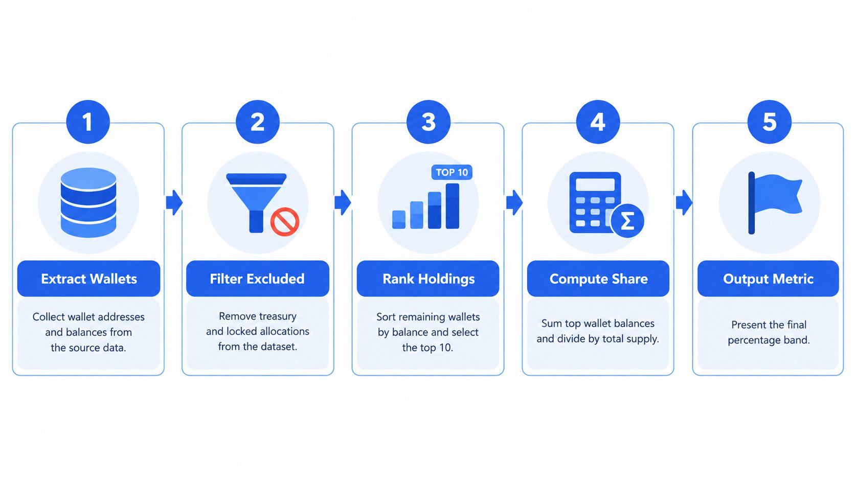
The calculation starts with live wallet data, not an old screenshot. That matters because token behavior changes fast, and a cached view can hide the movement you are trying to catch. A live read pulls the current holder set, identifies the wallets you care about, and then ranks them by share so you can see how concentrated the structure really is. If you want to check the holder set before sizing a trade, use a Solana holder checker.
The core inputs
A usable calculation usually looks at four pieces of information.
- Top-wallet holdings, because the largest accounts show where control sits.
- Treasury and locked allocations, because those should not be mixed with freely traded supply.
- Liquidity pool depth, because shallow liquidity can make a modest cluster feel much riskier in practice.
- The measurement window, because concentration can look different depending on whether you are checking the current state or a recent trend.
When a report excludes known safe pockets like burned liquidity or team vesting, it is trying to show the concentration that matters for trading. That is the same idea as removing supply that cannot realistically hit the market from the supply that can.
A quick sanity check
If a token has a few dominant wallets, a meaningful treasury lock, and a thin pool, the concentration read should be treated as tighter than the raw distribution line suggests. If the top holders are still large but the liquidity is deep and the rest of the wallet base is broad, the same raw number can look much less alarming.
The formula does not create certainty. It creates a cleaner lens.
MemeAssist computes reports from live on-chain and market data at the moment of analysis, which fits a metric like this because the answer should reflect current wallet control, not stale history.
Reading the Number Against Practical Thresholds
Thresholds help because a concentration number only becomes useful when you can place it into a band. The bands below are not hard laws, they're a practical way to sort what you're seeing into a faster risk read.
| Band | Indicative Range | Typical Read |
|---|---|---|
| Broadly distributed | Lower concentration | Looks more like a community coin, but still check liquidity and wallet behavior |
| Moderately concentrated | Midrange concentration | Watch the top wallets and confirm the distribution isn't hiding coordination |
| Tight control zone | Higher concentration | Treat as elevated risk unless liquidity and wallet behavior look unusually clean |
| Single-actor dominated | Very high concentration | Do not size up until distribution improves |
How to use the table
The right question isn't "Which band is perfect?" The better question is "What does this band imply for this token's actual wallet structure?" A token can sit in a middle band and still look healthy if the wallets are diverse, the pool is deep, and the trading looks organic. Another token can land in a seemingly better band and still look dangerous if a few related wallets are doing the controlling.
The table is most helpful when you use it as a first filter, not a final decision. If the token is broadly distributed, you still need to look at the wallet map. If it's tightly concentrated, you don't need to overcomplicate the read. The number is already telling you that control is clustered.
What to watch next
A good threshold read should always lead you to a second question:
- Is the liquidity deep enough that one wallet can't whip the market around easily?
- Are the top wallets independent, or do they look linked by timing and funding?
- Is the concentration stable, or is it changing as new buyers come in?
Those follow-ups matter because concentration is only one layer of risk. The band gives you the frame, but the wallet behavior gives you the story.
Three Solana Meme Coin Scenarios
The easiest way to understand this metric is to watch it behave in real market situations. Three token profiles can all show a concentration number, yet each one tells a different trading story once you look at liquidity, wallet clusters, and holder behavior.
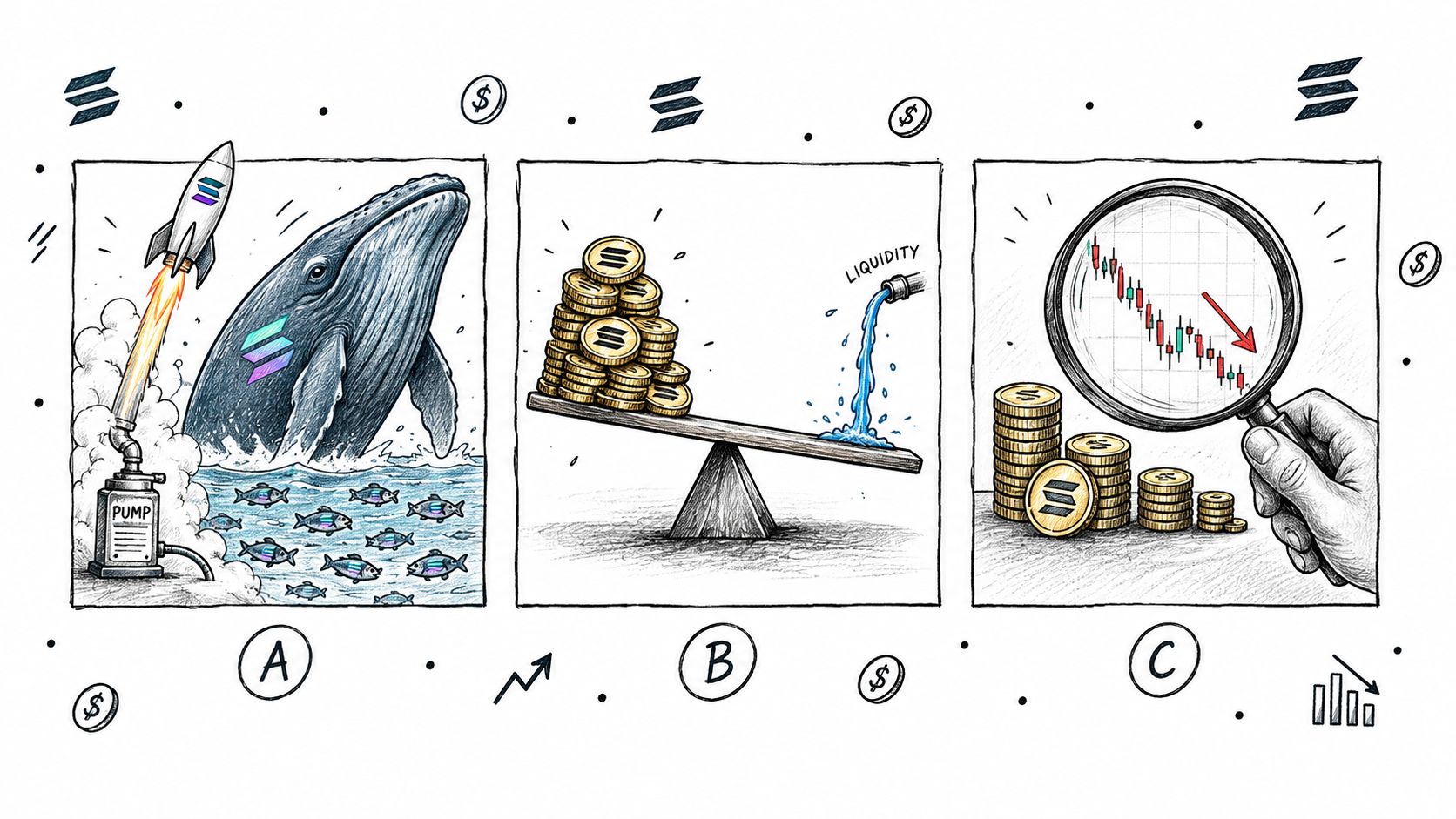
Scenario A, a fresh launch with a dominant wallet
A new Pump.fun launch appears, and one wallet clearly holds most of the supply while the pool is thin. That's the classic high-concentration setup. Even without a long history, the structure itself tells you the risk is real because one actor can influence both supply and market tone.
This is the kind of chart where buyers often confuse activity with opportunity. A few buys can make the token look alive, but if the wallet map is too tight, the same structure can unwind quickly. A token like this deserves caution before size, not confidence after the first green candle.
Scenario B, a mid-cap token with healthier depth
A later-stage meme coin may still show noticeable top-wallet share, but the liquidity is deeper and the holders look stickier. In that case, the concentration line isn't ignored, it's just read in context. The token may not be perfectly distributed, yet the market structure absorbs trades better and the holder base looks less like a control block.
Readers often overreact to a raw percentage. A moderate concentration level is not automatically a problem if the distribution is broad enough around the edges and the behavior looks organic. The number matters, but it doesn't outrank the rest of the evidence.
Scenario C, a large community coin with hidden clustering
A bigger community token can look fine on distribution at first glance and still show signs of bundle wallets or coordinated accumulation. That's the reminder that concentration alone doesn't tell the whole story. A token can pass a superficial check while still hiding a structure that deserves scrutiny.
The takeaway is simple. A concentration metric is a strong first read, but it only becomes trustworthy when you pair it with liquidity depth and wallet behavior. That's the same way a good analyst treats any single metric, as one line in a larger risk file.
Why No Percentage Is Universally Safe
Cosmetic safety uses the same logic. Regulators don't treat concentration as universally safe just because the percentage looks familiar. They compare exposure at that concentration with a toxicological benchmark, and they account for category, use pattern, and cumulative exposure. The result is a safety decision, not a number worship exercise. The same concentration can be acceptable in one product type and unacceptable in another because the exposure model changes.
That's the better way to think about token risk too. A percentage that looks fine in isolation can turn risky when you add thin liquidity, bundled wallets, or a creator history that doesn't inspire trust. The number is necessary, but it isn't enough. It tells you what the structure looks like, not whether the structure will behave safely under stress.
Concentration is an input to the model, not the model itself.
That's the cleanest mental model for meme coins. A single threshold can't be universal-safe because the token context changes the meaning of the number. If you treat it that way, you stop asking whether the percentage is “good” in the abstract and start asking whether the wallet distribution can support the kind of trade you want to make.
A Practical Checklist Before You Buy
Before you buy, read the concentration band first, then confirm whether the top wallets look independent. Check liquidity depth next, because shallow pools make concentration matter more. Then scan for locked supply, vesting, or bundle behavior, and only after that decide whether the chart deserves a closer look.
- Confirm the concentration band: decide whether the token looks broadly distributed, moderately concentrated, or tightly controlled.
- Cross-check liquidity depth: a thin pool can turn a mediocre distribution into a much worse trade setup.
- Scan wallet behavior: look for insider-style clustering, bundled funding, or synchronized movement.
- Check the trend: if the holder map is changing quickly, the concentration read may be improving or deteriorating in real time.
If you want a broader safety workflow alongside this metric, how to buy Solana memecoins safely is the right companion read.
MemeAssist pulls these signals into a single Solana report, so you can see concentration, liquidity, creator behavior, and wallet activity in one place instead of jumping between tools. Use maximum use concentration as your first lens, then layer the rest of the evidence on top before you commit capital.
If you want a cleaner read on Solana meme-coin risk, visit MemeAssist and run a live report on the token you're considering. It turns holder concentration, liquidity, wallet activity, and scam-pattern checks into a plain-English breakdown you can act on before you buy.